Project 11 - The project involved taking an 18th centuty painting that depicts an event and analysing how the event has been portrayed.
I chose Goya's Third of May 1808. I started by looking into the history and story behind the event depicted and found out that this is one of a pair of paintings. (It is thought possible that there were in fact 4 or more paintings in the series but the others have been lost.)
I then looked into Goya's depiction of events. Other Spaniard's painting similar events portrayed their countrymen as heroes wheras Goya decided to depict them as matrys. He showed the true events of 100s of rebels being shot by the French troops before dawn following their uprising in Madrid. His stark method of showing the corpse, the next victim and those waiting in line forces the viewer to think about the numbers involved and the effects of the event.
At the time Goya's picture was not exhibited as it was thought to be too brutal and unusual.
I enjoyed this project as it was interesting to find out more detail of the story behind the painting and to maek myself thing about the way that the artist has chosen to depict the event.
Showing posts with label Projects. Show all posts
Showing posts with label Projects. Show all posts
Friday, 25 June 2010
Tuesday, 8 June 2010
Project 9 - Select catalouge of prints
I'm really very unsure about what I should be doing for this project as can't find any information about what a catologue of prints would have inclulded. I have spent about an hour looking through my text book and searching the internet for ideas about how to tackle this and still none the wiser. Think I will talk to a couple of friends who have done art history in the past to see what they think and in the meantime jot down my ideas - maybe they're ok after all....
Devotional Prints
Suitable subjects would include
Suitable subjects would include
Portraits
To flatter the sitter dress them in fashionable, expensive clothes. Light them well so they look at their best. Include objects to symbolise their position or wealth.
- The Crucifixition - examples - The Raising of the Cross, The Three Crosses
- Eden - Texamples - The Expulsion from Eden, The Fall of Man
- Lives of the Saints - Joseph telling his Dream, The Stoning of St Stephen
- Miracles - St Francis Xavier, Christ healing the Sick
Suitable subjects would include
- Depictions of the Greek Gods - e.g Venus, Bacchus, Prometheus
Portraits
To flatter the sitter dress them in fashionable, expensive clothes. Light them well so they look at their best. Include objects to symbolise their position or wealth.
Wednesday, 26 May 2010
Project 8 - letter recommending Caravaggio
This was a lot more fun that I thought would be and I have mucked about a bit pretending to write in a style I think of as early 17thC!!! Not sure if I was supposed to write more about the kind of work that Caravaggio would produce but enjoyed researching more about his life etc. Wrote it in Word and used a nice curly font which makes it look more authentic too. Decided to do this option as really struggled thinking abouty how to tackle the option of selecting works for the Cardinals rooms.
On the 26th day of May in the year 1607
My dearest colleague
Our mutual friend de Marchoni has informed me that you are in the business of commissioning a work from one of the great artists of our age, de Marchoni has asked that I act as advisor to you in this matter as I am knowledgeable in the works of these fine men.
I would like to recommend to you the artist Caravaggio as in my opinion and that of many other men of this city he has a mastery unknown before and has a use of the light and dark within his paintings that is unseen before his time and is copied by many men but not matched in his expertise.
You may have heard of the reputation of Caravaggio and that he is a man who is very ready with his temper and with his sword. Indeed it is told that he did kill a man last year with his sword when he did reside in the city of Rome and at that time he did flee to our city of Naples. There may be truth in this story but we must only be grateful that we are able to give home to a genius and it is true that many men of great skill and talent do have a temper that is most firey. I must admit that the man is rouge and a blaggard and when he is not painting he does carouse around with his followers but he is also a hard worker and will produce for you a work of the finest quality and definition and in goodly time also.
If you should so wish for Caravaggio to produce a work for you his skill lies in making pictures that are on fine stretched canvas and made with paints of pigments and oils. He paints very fine religious scenes and as such can not be a man that is all bad and devilish. He is also much regarded for painting scenes of everyday life which tell in one simple image a story to the viewer. He is famed for his works the Fortune Teller and the Card Sharps and if you are able to view these images you will see his work is fine indeed.
I would suggest you commission of him to paint for you a depiction of an event in the life of one of our most holy saints. You will find that they way he treats his subjects will make you relate them to the real life men that you see around the streets of the city and it will mean that you feel closer to the saints in this very way. He has a way of painting a man that is so real to life and natural in its forms that it does make you feel like he may be able to reach out and touch your very hand.
You will find that his pictures have such bright light and have the contrasts of such darkness. He is such a master of this style that it has been named for him and other men like to paint with this much more pronounced chiaroscuro that has been called the tenebrism but some men would call it the Caravaggism.
I recommend again to you that you disregard the tales that you may hear of the ways of this master and if you would consider him for your commission I am able to arrange for you to meet and discuss the matter further.
Yours most truly
R Wiccoco
Tuesday, 18 May 2010
Project 7 - Anaylsis of Painting
Analysis of 16C Painting with a Mythical Subject
Bacchus and Ariadne – Titian, 1520-23, oil on canvas, 172.2cm x 188.3cm, National Gallery - London
Unfortunately I haven’t been able to view a suitable painting so chose one of the suggestions for annotation and have had to complete this analysis looking at reproductions of the original.
On first looking at the picture the first thing I notice is the brightness of the colour and that there is a lot going on. My eye was first drawn to the figure of Bacchus just off centre – his pink cloak flying behind him showing that he is in motion. His attention is focused on Ariadne to the left. Ariadne is facing away from the viewer looking out towards the sea. Her head is turned towards Bacchus with an expression of shock, her hand is pointing towards the sea. She is separated from the other figures and only linked through her looking at Bacchus. The way the picture has been composed leads the eye in and around.
Aerial perspective has been used effectively to show the landscape is in the distance by the technique of using dull, muted blues. Perspective has also been used in the group of followers as those towards the back are smaller than those in the foreground.
The picture can be split into 2 halves diagonally from corner to corner. The top half is bright and predominantly blue. The figures of Bacchus and Ariadne are painted more vividly than the others making them the dominant figures. Also pictured are 2 cheetahs looking calmly out to sea.
The lower half is painted in duller shades and contains a group of mythical men and women.

The figures at the front of the pictures are dancing, making music and behaving crazily. A baby satyr (similar to a fawn) is the only character who looks out of the picture and seems to lead the group which consists of grown satyrs, maenads and an overweight man who appears to be asleep on a donkey. One of the satyrs is twined with snakes and the other is waving an animal’s leg in the air. The head of an animal (cow or donkey – I can’t be sure which) lies on the floor. A dog, wearing a collar faces the baby satyr. On the floor at the left of the picture is a large cloth with a gold cup sitting on it.
This shows the way the group of followers seem to curve round the right of the painting.

The picture was created as part of a series for the Duke of Ferrara. It depicts the classical story told by Ovid and Catullus. Titian has included lots of details from the story and has used symbolic imagery to convey the tale.
Ariadne the daughter of the King of Crete had run off with Theseus who has just abandoned her. This is shown by the ship at sea and her facing towards the sea looking out after him. Bacchus arrives on his cheetah drawn chariot with his followers. He falls in love with her immediately, but she is at first startled by his arrival as shown in her facial expression and body language. The couple then marry and when Ariadne dies Bacchus commemorates her eternally by sending her crown into the sky to form a constellation of stars -hence the stars in the top right shown against a daylight sky.
The story talks about the Bacchantes (followers of Bacchus), “Some brandished ivy spears with leafy points. / Some tossed pieces of a ripped apart bullock. / Some wreathed themselves with coiled snakes.” and also, “Others were striking drums, their palms raised high / or were stirring shrill chimes with polished brass cymbals./” (Catullus, The Wedding of Peleus and Thetis – trans T Banks in De Rynck 2004) All of these images are easy to find within the composition and convey the idea of madness they are meant to. The overweight man on the donkey is Silenus, Bacchus’ foster father and is thought to be sleeping off his hangover.
Images that Titian has added may be related to the Duke and included to personalise the painting for him. Titian often included dogs in his pictures and it is thought that this dog could be a pet of the Duke’s court. Titian has signed the painting on the golden cup and it is possible this is a representation of one of the Duke’s belonging.
Looking at Titian’s interpretation of the story in comparison with two other 17 C examples demonstrates how masterful he has been in his use of colour and skilful representation of the characters and story.

This picture by Ferdinand Bol was painted over a century later. Although he
has used beautifully bright colours for Bacchus’ clothing, the characters look stilted and far more posed that Titian’s. You have no sense of the wildness of Bacchus’ character as Bol’s Bacchus looks incredibly staid and gentlemanly! Titian’s use of other figures enlivens his version making it far more interesting for the viewer.

L’Orbetto’s depiction of the myth includes some of the characters from the story as used in Titian’s painting. You can recognise Silenus the drunkard and one of Bacchus’ Maenads is placing the coronet upon Ariadne’s head. In contrast with Titian this painting seems dull and staged. Titian manages to compose his picture to make his characters seem alive and as if we have just happened upon the scene.
Looking at this painting in more depth has made me aware of how great a painter Titian was. Looking at the symbolism used and how the painting links to the story has helped me reflect on the work that artists put into their paintings before they even start. Comparing his colour and composition to other artists has enabled me to think more about the differences between painters and start to make my own personal judgements about what I feel makes a good painting.
Bibliography
De Rynck, Patrick, How to Read a Painting – Decoding, Understanding and Enjoying the Old Masters, 2004, Thames and Hudson , London , England
ONLINE - www.nationalgallery.org.uk/.../titian-bacchus-and-ariadne Accessed 17/05/2010
ONLINE - en.wikipedia.org/wiki/Bacchus_and_Ariadne
Accessed 17/05/2010
Saturday, 17 April 2010
Project 5 - Build up an annotation
St Clare - Anonymous
1283
Tempera on wooden panel
9ft x 5ft
Monastery of Santa Chiara in Assissi (Monastery of Saint Clare)

1283
Tempera on wooden panel
9ft x 5ft
Monastery of Santa Chiara in Assissi (Monastery of Saint Clare)

This large panel is mostly taken up by the image of St Clare with eight smaller scenes from her life around her. St Clare's body is depicted as slender and elongated. It takes up nearly the entire length of the panel. She is shown wearing a brown hooded flowing robe with a blue dress. The folds are depicted in a stylised way but are natural in that they show the shape of her body beneath them. You can not see her feet but these are suggested by the folds and drapery at the bottom hem of her dress. She wears a knotted belt and an ornate cross on her left breast. Her left hand hangs down and appears to be holding the staff of the cross. Her right arm is raised and her hand lies across her upper body towards the cross. Her expression is solemn and pious and she looks straight ahead at the viewer. She has a circular gold halo ringed with black. St Clare stands between slender columns with vaulted arches. There is an angel on each side of her halo. There are four scenes from St Clare’s life on either side of her. The main colours used are gold, blue and shades of brown and red.
The halo shows that the image is of a saint. The large size and subject matter indicate that the panel was created for a religious building. The architecture depicted, slender columns and pointed arches, place the image in the Gothic period. The use of expensive blue paint and gold indicate that the panel is of importance and value. The knots in St Clare’s belt symbolise poverty, chastity and obedience. This can help the viewer to know that she was a follower of a Franciscan Order.
This image was created only 30 years after St Clare’s death so is fairly contemporary. It was created to be used as part of a screen dividing the nave from the chancel. St Clare was a peer and follower of St Francis and founded the Order of Poor Ladies. She is not as well known as St Francis or depicted as often. A World History of Art suggests this is probably due to the fact that men were patrons of the arts and unlikely to be interested in a woman’s cult. At the time that this image was created nearly all visual arts had a religious theme and purpose. Scenes from St Clare’s life surround her. A World History of Art relates the stories behind some of these images – they show St Clare’s life from when she made a decision to live in poverty and was given the Bishop’s blessing, her joining the Franciscan community, her miracle of multiplying loaves to support the community, through to her deathbed. These images would be used to tell followers of her life.
I chose this image to annotate as I find it appealing, perhaps because it is of an important woman when so much art of the time depicts men (other than the many depictions of the Virgin Mary). The scenes from St Clare's life add meaning to the image for me and led me to become more interested and find out more about her. I think the image works for its original purpose and I can sense how it could have influenced women in early medieval times to have followed the Order of Poor Ladies.
Sunday, 11 April 2010
Project 4 - Visit to Salle Church
Understanding Western Art 1 – Project 4
Visit to Salle Church
For project 4 I needed to visit a Gothic church or cathedral to look at features I have been learning about in Unit 4. My husband, who has an interest in church architecture, suggested Salle Church

Structure, Engineering, Decoration
Building on the current church was started in 1400 and mostly complete by 1430. This short building period led to their being no changes in the design as was often the case on longer projects. Their have also been no later additions and it is almost entirely in its original Perpendicular style. Although renovated in the 19th century, a local land-owner and medieval enthusiast ensured that this was carried out sympathetically retaining as much of the original as possible rather that altering the features to become Victorian Gothic as was the case in many other local churches. (Online – www.reephambenefice.org.uk/sallehistory.html)
On arriving at the church I walked around the exterior. The church follows the crucifix shape and lies with its main door to the West with transepts at North and South. Unusually it has two additional porches extending to nearly the same distance as the transepts which were built to house the additional chapels required by those funding the building.

The church does not have any visible flying buttresses (but these are more likely to be found on larger churches/cathedrals.) However, Brown (1998, page 196) describes how, “In the clerestory roof the wall posts are tenoned into the ends of the aisle beams, which protrude through the wall and so ensure that the outward thrust is carried to buttresses on the outside of the aisle wall, thus acting rather like flying buttresses.”
From the outside you can take in the large pointed arch windows with rib tracery. The majority of glass is clear with only some of the original stained glass remaining. Each of the individual chapel doors is decorated with carving around. The main entrance of the West door is ornately decorated with coats of arms above, angels on either side in the spandrels and niches which would have originally have held statues.
On entering the church my first impression was of light and space – completely in keeping with the Gothic ideals. The large windows along the aisles and at the East and West ends flood the church with daylight. Jenkins (1999 page 469) describers an interior of “immense height and volume.”

Just inside the main door you come to the traditionally East Anglian Medieval carved font of the seven sacraments. Norfolk
Looking up I noticed that the roof of the nave is not vaulted as I would expect after reading about Gothic architecture. Instead it is of ‘plain arch brace’ (Jenkins 1999 page 471) On closer inspection I can see traces of the medieval carvings and decoration. The church leaflet states that it is possible to see the colour of the 15th century paint if you use binoculars. Between the braces are carved angels and flowers.
Moving down the church towards the transepts and chancel you pass the medieval wineglass shaped pulpit. The colours have faded but it is possible to imagine how bright it would have looked in the past.

The transept roofs are ornately decorated and it is alleged that they were the inspiration for the roof in the House of Lords. (Jenkins 1999)
The chancery is dominated by the vast East window. A small amount of stained glass remains and it must have been breathtaking in its fully coloured state. The roof is also richly decorated and the choir has its original stalls and misericords. I was very interested to look at the carvings of the seat backs and arm rests as I find the range of subject matter and delicacy of the work really appealing. If the church hadn’t been so cold I would have stopped to look at them for a lot longer!
Size, Planning, Use as a Place of Worship
When arriving at Salle church it seems to be in the middle of nowhere! There are a few houses along the road to it but it is surrounded by fields. Yet the church is large, bigger in size even than some small town churches. As Jenkins (1999 page 469) states it is, “..far beyond the means or needs of its community.” Its history and the people who funded it explain why it is so large. The area had several wealthy families (lords of the manor) who had made their money from wool. These families of ‘new-money’ wanted to build a large church as a symbol of their success, to compete with the old-money families who had built a church in the nearby village of Cawston
The need for chapels for the Gilds was met by the additional porches as each housed a small chapel. There is also a small chapel on a floor above the porch at the West end. In the 15th century the lords of the manor employed 12 clerks to work in the chapels. At this time the church must have been very busy. The employees would have attended services and have been reminded of the wealth of their employers.
The families decided to use expensive stone brought from Peterborough
The church is still in use today even in such a small parish. It has regular Sunday services and special celebrations during religious festivals. My visit was just after Easter and there were additional chairs set out in the aisles, leading me to think that they must have a large congregation to need the extra seating.
Commemoration
The families who paid for the church to be built have their coats of arms above the West door. This would remind all who entered of their prosperity and spirituality. It also commemorates the families involved. One of the families were the Boleyns (it is rumoured that Anne Boleyn is actually buried in the church). One of the other families, the Morleys, are still local land owners and farmers today.
Other forms of contemporary commemoration also mark the lives of those who paid for the building. Jenkins (1999) describes how an ‘E’ is worked into the tower parapet in memory of Evarard Brigg who funded the tower. The church’s own guide mentions how the transepts commemorate their donors with their initials.
Throughout the church are other commemorative features including floor and wall brasses. These date from the time of building to the present.
http://www.norfolkchurches.co.uk/salle/salle.htm
http://www.norfolktouristinformation.com/norfolk-tourist-information/detail.php?siteid=185
http://www.salle.churchnorfolk.com/
Monday, 5 April 2010
Project 1 - Part 1 and 2
Planning - have written out lists of annotations, postcards, projects, visits, reading & watching and assignments and stuck them into inside of kitchen cupboard. Good visully reminder of what needs to be done. Also nice to cross things off as I go along so can see how far I've come.
Emailed tutor re first assignment due date - I've suggested end of April. (Now 5th and not sure if I'll quite make it but going to keep trying for it!)
Books - Buy Art and Artists dictionary. Borrow other books as and when, buy anything I really like or find really useful.
Questions to ask about art -
Looking at it...
- what is pictured?
- what colours have been used?
- how effective?
- medium used?
- where does light come from?
- is it realistic?
- artist?
- size?
- when was it created?
- purpose?
- does it depict an actual event?
- is it imaginary?
- background info - when in artist's career? historical connotations?
- symbolism of items, people - might learn more about this as go along and do from looking?
- hidden meanings
- narratives
Saturday, 3 April 2010
Project 3 - Studies of Roman figure sculpture
For project 3 I needed to make studies of several free standing Roman figure sculptures (including copies of classical Greek statues). I've not done any life drawing so have no experience of drawing figures to compare this to. I didn't have easy access to any actual Roman sculptures so used images from the course book to copy. I chose the statues to copy as they were interesting to me or stood out in some way.
 I started with a sketch of Doryphorous and it didn't go very well as you can see! The top half is much much bigger than the bottom - I should have not worried about the end of the paper. I decided to look at the figure a lot more closely and actually took a ruler to it to measure the head and other key points. For the next sketch I drew myself some rough guide marks before starting and this helped get the proportions right. Sketching this made me think about how skillful the artists who created these statues were - very strange to think that the Roman artists making copies were thought of as simple manual workers as they were clearly extremely talented.
 My second attempt at Doryphorous - much happier with the proportions on this in relation to the image of it. Looks a little top heavy - not sure if this is due to my not v good drawing skills or the idealised form with a developed chest and upper body taking prominence.

This next sketch shows Augustus from the early 1st C AD.The sculpture is modeled on the previous sketch of Doryphorous but with some changes. Augustus is shown with his right hand raised and pointing (in a speaking pose - A World of History of Art). This gives the figure a more authoritative look and is used to show that Augustus is a leader of men. The carving on the draped cloth is stylised rather than naturalistic - it seems to be both elegant and dramatic with the drapery over the left hand and falling down at the side which aids the balance of the piece. The carving on the body armour is thought to show symbolic scenes from the story of the Roman victory over the Parthians (A World History of Art -p 196) The whole image is very different to the previous one on which it is based - this seems to obviously be a powerful leader. I'm not sure if he looks powerful because of the pose or because he looks like Roman Emporer statues I have seen prviously. I am not sure on the significance of the addition of the small cherub - it could have been used as a method for hiding the support but am sure there is a better reason than this.
 My next choice was Discobolus - chosen as I think it is an easily recognisable piece and I like the fact that the posture is different from a lot of other pieces (mostly upright poses). I chose to use charcoal for this and to work quickly. This helped me see how the shapes are connected e.g one long curve down from the top of the arm holding the discus to the bottom of the other arm. Having just had a go at copying this pose I don't think it is very natural! It is unlikely that an actual discus thrower would be in this position - the pose has been chosen to show off the grace and athleticism of the body.

 The final images were chosen more because I wanted to have a go at drawing them and as they stood out to me as I was looking through the images. They include a sleeping Eros, a portrait bust and Samothrace. They helped me to think more about the skills of the sculptures and the variance of subject matter shown in Roman art.

The first sculptures I chose to copy were Doryphorous and Augustus. I chose these as am interested in the idea of using classical Greek idealistic bodies with portrait heads. Augustus has the body of Doryphorous but not only has a portrait head but also Roman clothes added and changes made to the position of the arm.


This next sketch shows Augustus from the early 1st C AD.The sculpture is modeled on the previous sketch of Doryphorous but with some changes. Augustus is shown with his right hand raised and pointing (in a speaking pose - A World of History of Art). This gives the figure a more authoritative look and is used to show that Augustus is a leader of men. The carving on the draped cloth is stylised rather than naturalistic - it seems to be both elegant and dramatic with the drapery over the left hand and falling down at the side which aids the balance of the piece. The carving on the body armour is thought to show symbolic scenes from the story of the Roman victory over the Parthians (A World History of Art -p 196) The whole image is very different to the previous one on which it is based - this seems to obviously be a powerful leader. I'm not sure if he looks powerful because of the pose or because he looks like Roman Emporer statues I have seen prviously. I am not sure on the significance of the addition of the small cherub - it could have been used as a method for hiding the support but am sure there is a better reason than this.


 The final images were chosen more because I wanted to have a go at drawing them and as they stood out to me as I was looking through the images. They include a sleeping Eros, a portrait bust and Samothrace. They helped me to think more about the skills of the sculptures and the variance of subject matter shown in Roman art.
Sunday, 28 March 2010
Visit to Surrey House - Norwich
When planning my first visit of the course I wanted to try to stay as local as possible. This was due to time constraints and also the feeling that we very often overlook the amazing architecture that we see everyday around us. Having viewed the DVD and read a little about Classical Greek architecture I have been overwhelmed by how much of these influences are reflected in the buildings around me. I decided on Surrey House for my visit as when I started to research possiblities I kept coming across information on this building and was intrigued. I had walked past it before but never looked closely and wasn't even aware of the elaborate interior.
Building work on Surrey House commenced in 1900 and continued through to 1912. The building is still being used for its orignial purpose today as headquarters of the Norwich Union insurance company (now Aviva). Local architect George Skipper was comissioned to design the building and he created a functional office space with various Greek and masonic symbols. These were due to the influence of a descendant of the Union's original founder who was a classically educated prominent Mason. The design uses themes of insurance, protection and wellbeing to show customers the strength and prosperiety of the company. (Surrey House - the magnificent heart of Aviva - in house publication)
I'd done some research on the origins of the building online, then on Friday (26th March), I had an unexpected free afternoon so off I went with camera and sketchbook.

I started by examining the exterior. The building is certainly grand. Six symetrically placed corinthiun columns are placed above ground level on the front of the main frontage to the bulding. The frieze above the columns reads "NORWICH UNION LIFE INSURANCE SOCIETY" (Let's hope Aviva don't decide to change this part of the building!) Above the frieze is a Greek temple style pediment with cornices and dentil. The windows are placed to give the building an overall feeling of balance and have columns around the 1st floor and roman styled arches on the ground floor. Everything about the building is balanced. Note the insignia on either side of the main columns and the balustrades which appear again along the side walls and at the front to the courtyard.

Very much part of the building but at street level are two life size statues depicting prominent figures in Norwich Union's history. These would be used to remind customers of the importance of the society and it's founders. The patterned border above the statues appears classically Greek and is repeated on the main building.

On going into the building you go through an entrance hall before walking into the overwhelming opulance of the main hall. These are decorated to complement each other and the transition from one to the other is hardly noticable. Now housing a large reception desk and a few sofas, this hall was orignally used as the main place of business, full of desks for the society's tellers and where customers would come to pay their premiums. What could fill you full of confidence in your insurance company more than a room completely made from marble? The guide book tells me that there are 15 different types of marble used in the building. Skipper convinced the society to purchase this at a bargain price as it had been brought to England to be used in Westminster Abbey but arrived too late. It is difficult to take everything in and I spent a long time sketching and taking photos. Everywhere you look is decorated, the patterns on the floor, walls and ceiling are geometrical with sculptures and reliefs of fruit and flowers, alongside coats of arms of London, Dublin, Glasgow and Norwich - to emphasise the importance of the city of Norwich in the British Isles. The symbols of the Life Society's orignal coat of arms are also present - "a winged hourglass representing the swift flight of time" - this would remind people to purchase life insurance to provide after their deaths. "The serpent and dove for wisdom and purity" customers are subtly being shown that the society is dependable, trustable and wise. "...and the clasped hands for friendliness" - above all your insurance seller is your friend! (Surrey House - the magnificent heart of Aviva - in house publication) The ceiling is domed in a Roman style and hanging down is the amazing air conditioning/heating system designed by Skipper. He was adamant that there should not be radiators to mess up the lines of his building (an advantage of building in this style at a later date he could forsee this!) A pendant hangs over a "fountain" and the design means that cool air is wafted through the hall (total change of fresh air every 20 minutes!) in the summer and with heat coming up from underneath in the colder months an opposite effect of warm air being placed in the hall. I asked a member of staff if this is still working and it is to this day and they say that it really does keep cool in summer and warm in winter.
I was fortunate on my visit to have a security man ask if I would like to take a look upstairs, not usually open to visitors. This meant I got to go up the marble staircase and look down on the main hall - an incredible view. On the way up the stairs hang a series of portraits of directors through the ages.
I also was able to view the Board Room. "A diversity of rich colours, styles and textures" The ceiling is painted with scenes from Greek Mythology alongside yet more reminders of the passing of time and the influence of fate (buy that insurance now!)

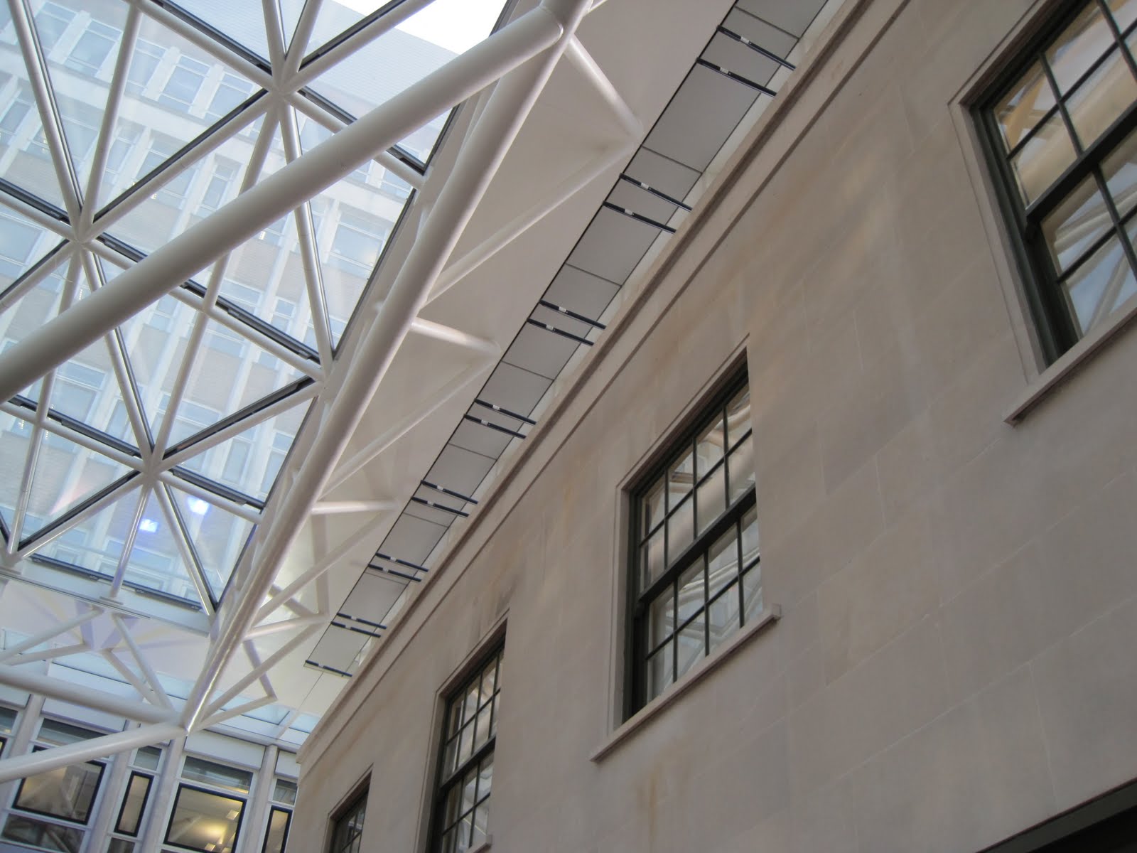
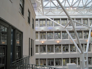
I was then taken to scramble through a window on to a roof terrace and the security man talked me through the additions to the building as the company has grown. A new wing has been added in each of the decades from the 60s to the 80s. This left a patch of garden at the back which had become derelict. The atrium was opened in 2006 - this joins the 4 different builidings and provides a large and light space for employees to eat and hlod informal meetings.

Overall feelings on the design of the building
I think that Surrey House is undeniable an amazing building and will be urging friends and family to visit and see for themselves. However, personally although there are elements that I really like overall I find it too much. I find the front agreeable and an impressive and beautiful building. Internally I think there is too much of a mix match of styles and that it is a bit over the top. I think for it have been built as an office and still to be in use as such today is wonderful and that it must have been very exciting for the Edwardian residents of Norwich to have such a new building as their insurance headquarters. I hope that it stays with Aviva for many years to come as an important piece of architectural and economical history.
Links to websites with information on Surrey House
Wednesday, 10 March 2010
Project 1 - Part 3 - My Course Aims
I have decided to take Understanding Art as the first course of my degree with the OCA. I plan on concentrating on practical courses for the rest of my degree and don’t want to follow an art history path but think that what I learn over the next year will be really helpful in my future learning. Having no formal art training other than GCSE (nearly 20 years ago) I want to get some background knowledge and lots of practice in annotating, writing and thinking about art.
I have decided to do an art degree for a few reasons. Firstly because I finally have a vague career plan and would love to be able to teach art at some point in the future (I am currently a further education teacher working with young people with special needs and teaching literacy numeracy and ICT skills). This ambition is another reason for choosing Understanding Art – the theory skills would definitely be useful if teaching the subject.
I have also decided to do this art degree as I have spent the majority of the past 10 years studying and 2 years ago achieved a First Class Honours Degree through the Open University. After a bit of a break I need to do more learning but fancy something a bit more fun. When I left school my plan was to study art and eventually go to art college but life got in the way and instead I dropped out of college after 6 weeks and went to work in a factory – I’ve got back round to it at last! Again having recently completed a degree has influenced my decision to take Understanding Art – I am interested in finding out how to write academically in a different style and for a different purpose.
At the end of the course I hope to have a lot more knowledge about the subject than I have now. I also hope that I will find out I already know more than I think!
I want to be able to confidentially recognise different architectural styles - to tell the age of buildings or know the styles that have been used in designing them.
I can currently identify some artists work or styles. By the end of the course I want to be familiar with a range of artists from different periods and know a number of their works. I hope that I would be able to visit a gallery and recognise major works and be able to classify other works by age, style etc.
I want to become confident in annotating as this will be particularly useful when working on my logbooks in my future courses. I want to have a mental checklist of the questions to ask myself about any work I am looking at whether I am formally annotating it or not.
As the course progresses I want to become more confident in deciding which styles of art I find most appealing. I hope that I will be able to identify what I like and don’t like about different works which in turn will help me to find my own style when moving on to practical courses.
Overall I hope that I will enjoy the course even if I find some aspects more challenging and that I will complete all the projects collect all the postcards, make all the visits and get all my assignments in. Through doing all of the above I hope to go for accreditation and pass.
Subscribe to:
Posts (Atom)
